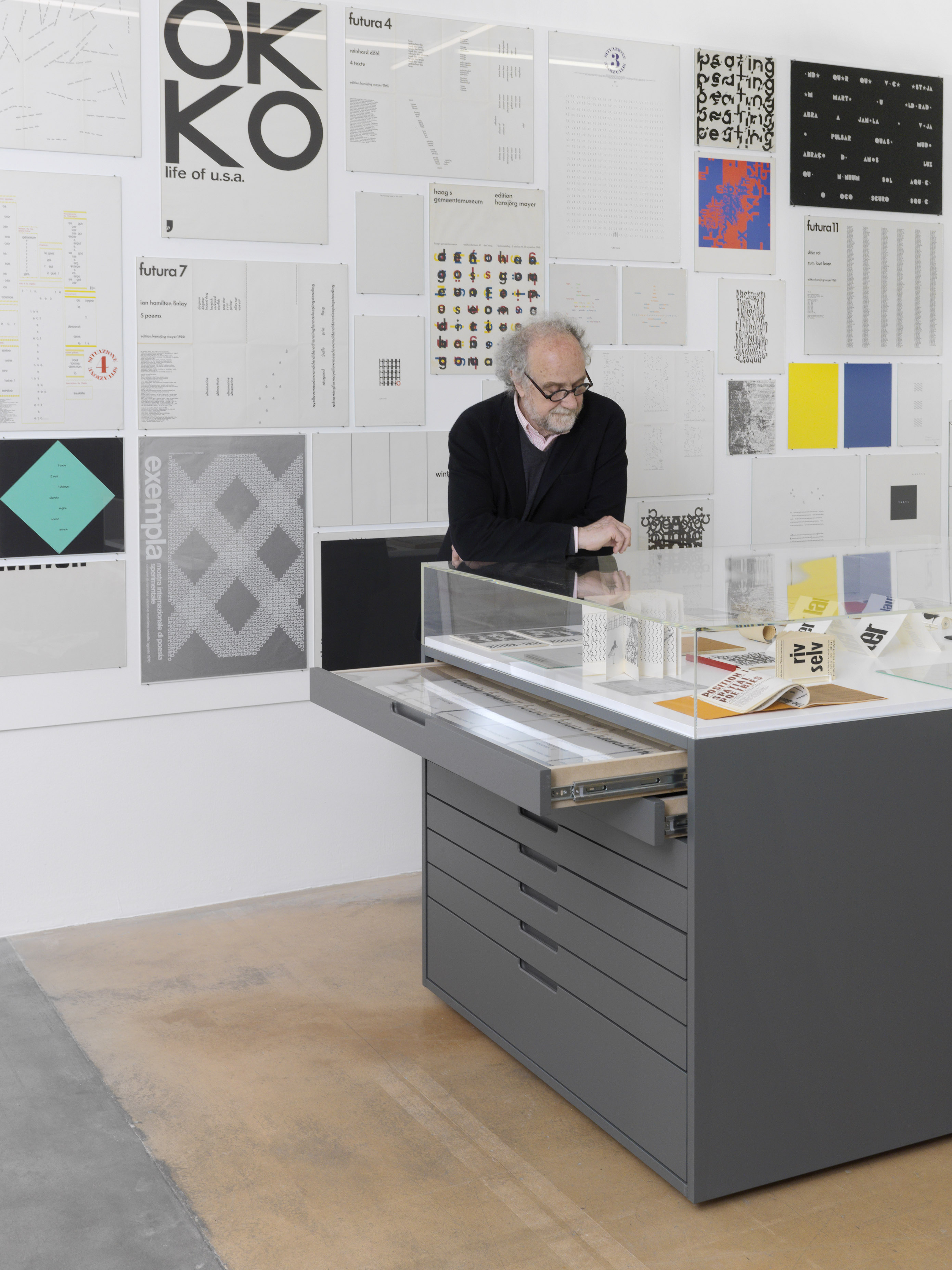
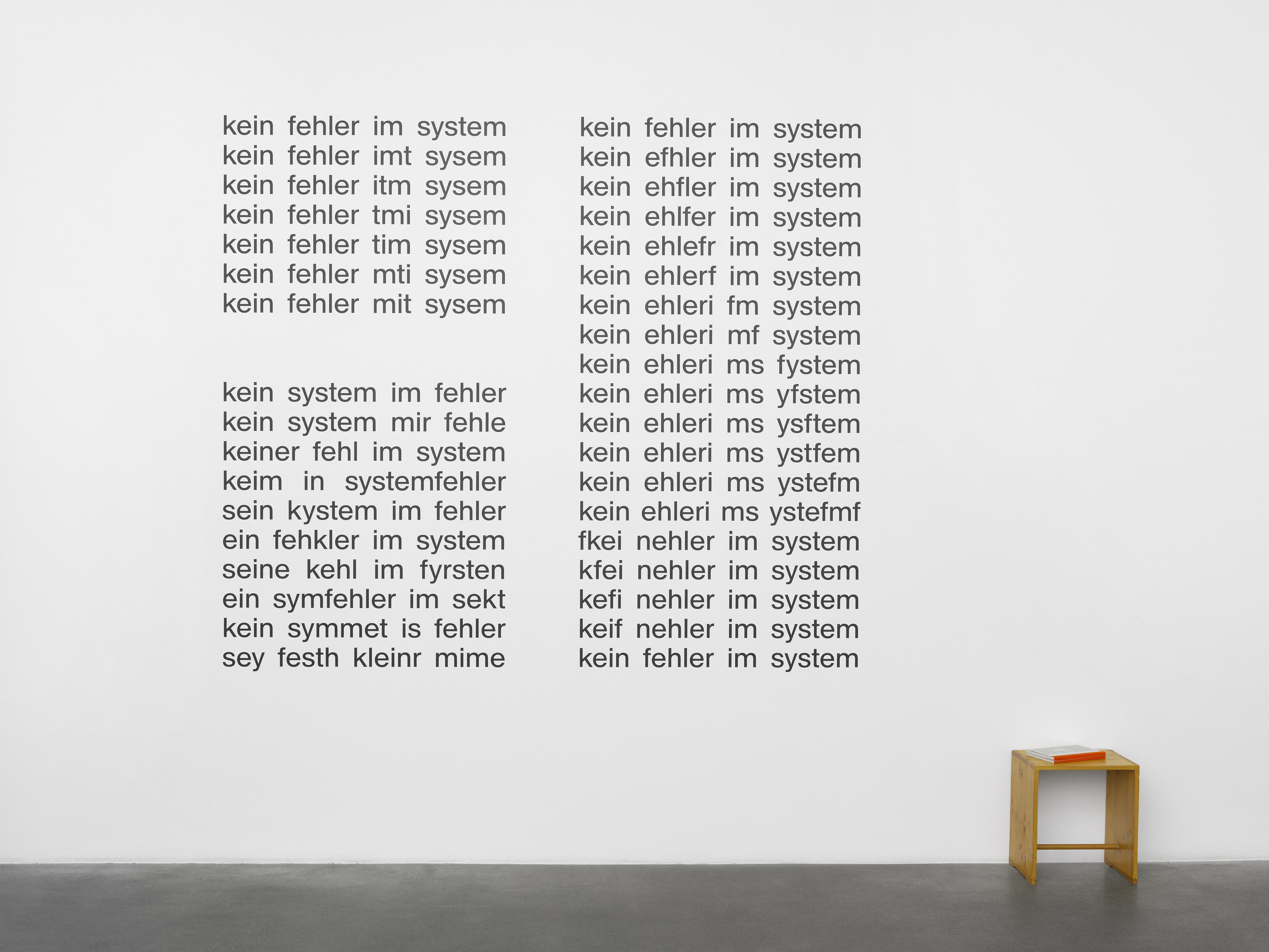
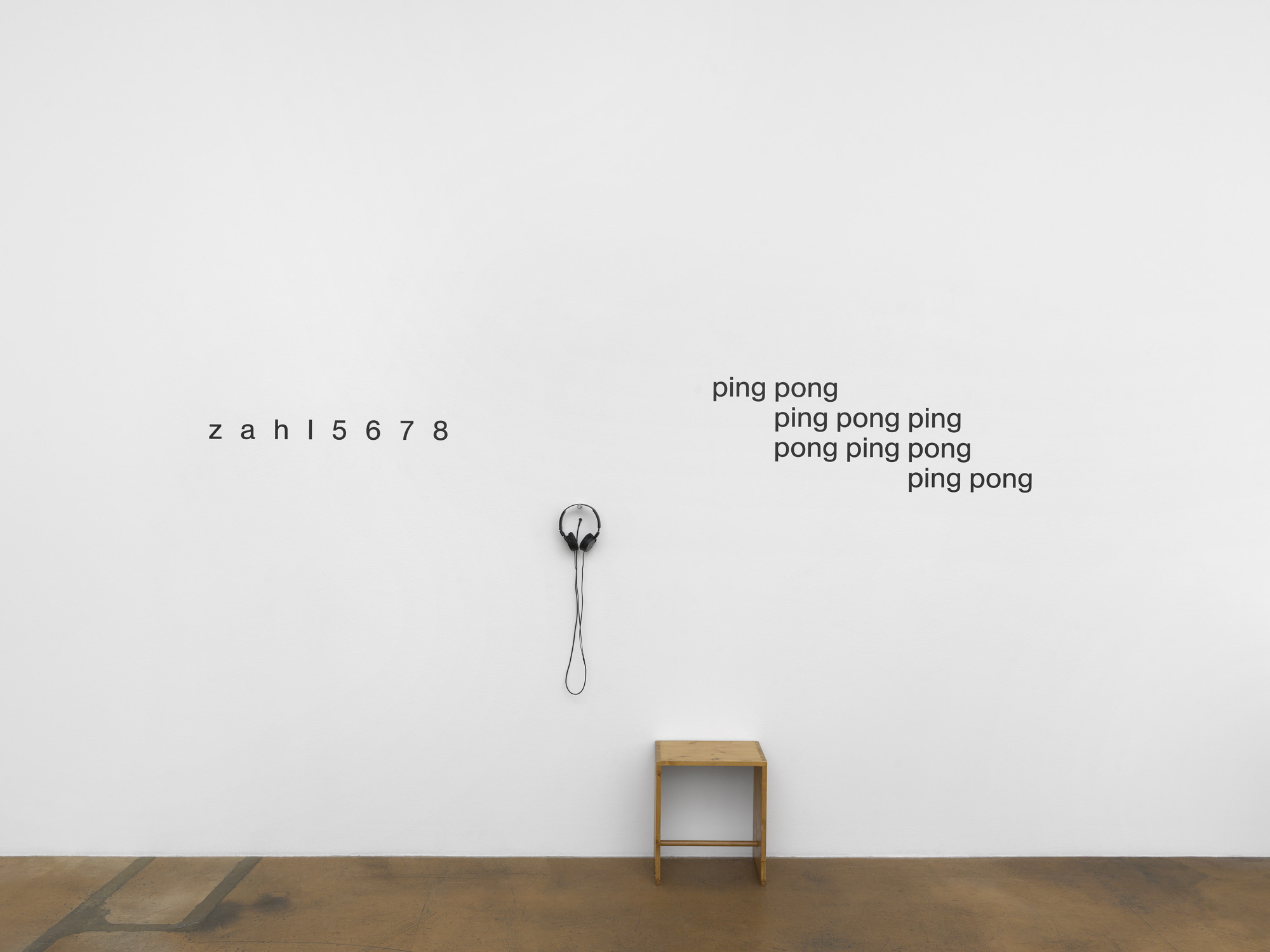
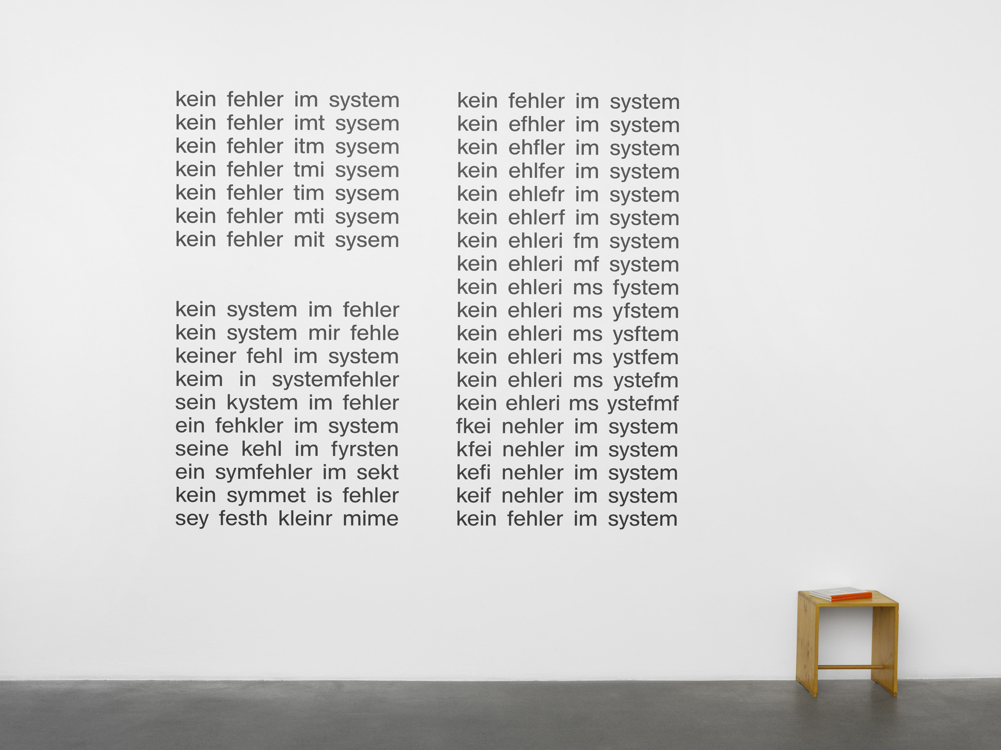
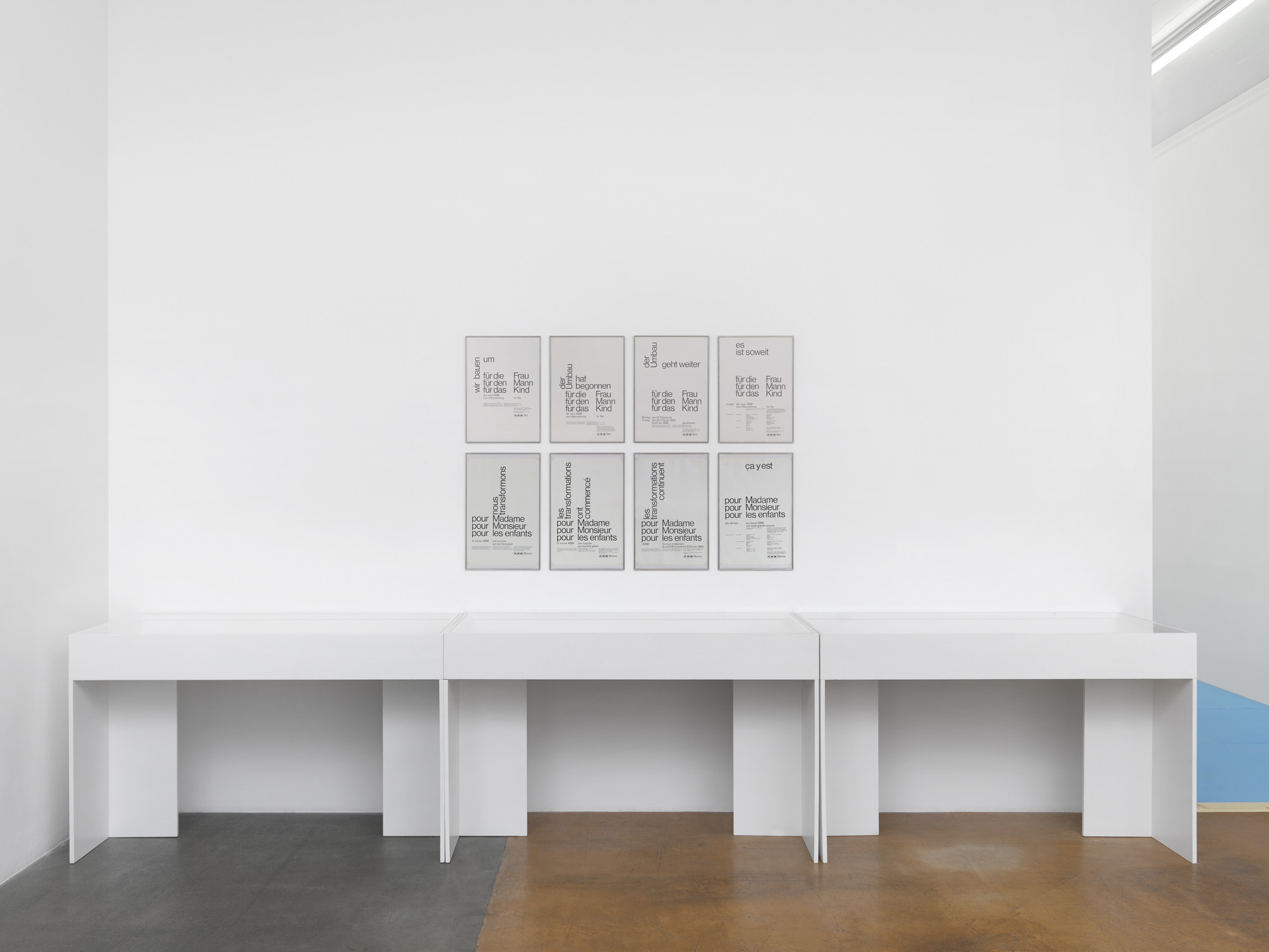
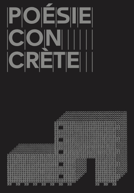
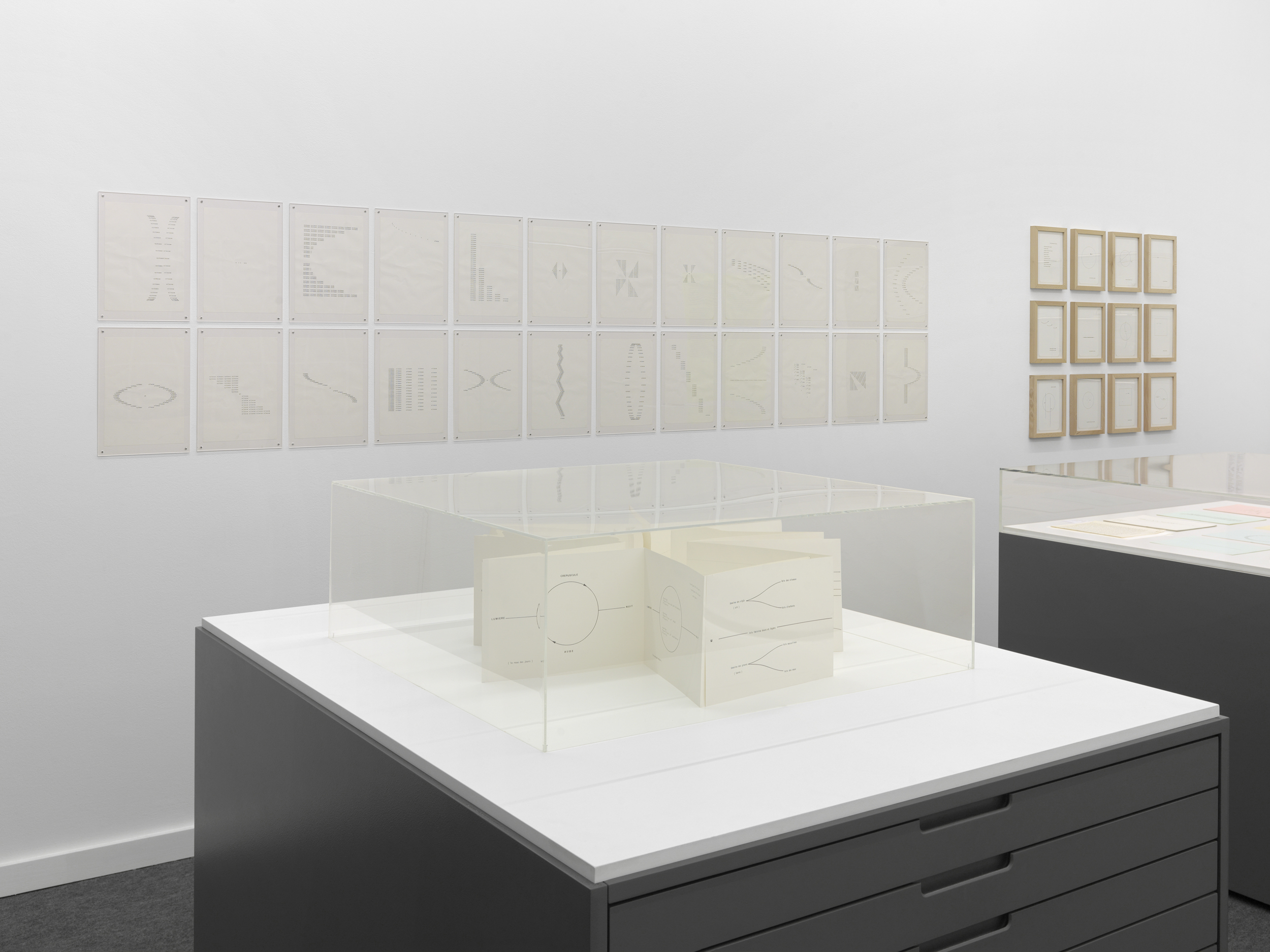
This exhibition gave insight into the work of Bolivian-born Swiss poet, writer and publisher Eugen Gomringer (b. 1925). Often referred to as the “father of Concrete poetry,” he was an active figure in the design and art scenes of post-war Switzerland, giving poetry a voice at the intersection of literature, art, and design that continues to resonate today. Although his work is less well-known in the French-speaking world, Gomringer is one of the most important representatives of the international movement of Concrete poetry, which since the early 1950s has been examining letters, words and language for their most essential verbal, vocal, and visual qualities.
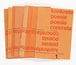
Early encounters with the Zurich Concrete art scene—including the artists Richard Paul Lohse, Karl Gerstner, Verena Loewensberg and, most importantly, Max Bill—, deeply influenced Gomringer’s approach to poetry and ultimately led to his first Concrete poems. Together with Dieter Roth and Marcel Wyss, Gomringer was the co-editor of the artists’ magazine Spirale, founded in 1953. This collaboration would mark the starting point of his new form of poetry, called “constellation,” in direct reference to Stéphane Mallarmé’s 1897 poem Un coup de dés jamais n’abolira le hasard. In the following years, Gomringer worked as Max Bill’s secretary at the Ulm School of Design (1954–1957) and had encounters with the writer and philosopher Max Bense, as well as the Brazilian Noigandres Group. From 1960 until 1964 Gomringer edited 11 issues of the self-published series konkrete poesie / poesia concreta, a small format publication, each focusing on the work of a fellow Concrete poet.
The works shown in this exhibition highlighted Gomringer’s practice at the crossroads of design, poetry, and advertisement. Advocating interdisciplinarity throughout his career, he actively collaborated with artists and graphic designers such as Max Bill, Karl Gerstner, Anton Stankowski and, most notably, the Zurich-based design studio E+U Hiestand. From the 1960s up to the 1990s, the poet was active as an art director and copywriter for companies throughout Switzerland and Germany such as abrasives manufacturer SIA, Fürst hats, German ceramics producer Rosenthal, and the iconic Swiss department store ABM, for which he developed public relation concepts, advertisement slogans, and strategies. Often renouncing the use of additional imagery, his explorations in Concrete poetry paved the way for copywriting and advertising language that exalted the form, sounds, and shapes of language
- Exhibition conceived by Simon Mager, who led the research project “Words Form Language – Typography Forms Meaning” initiated and supported by ECAL/University of Art and Design (HES-SO), and by the DNP Foundation for Cultural Promotion (Graphic Culture Research Grant), Tokyo.

Traces of Articulations
